Choosing a theme
The Style tab in the builder allows you to choose a visual theme for your survey. The theme determines the appearance — background, button colors, fonts, and accents. The survey content remains unchanged.
Theme catalog
The left panel contains a catalog of themes grouped into categories: Essentials, Blends, Abstract, Business, People, Tech, Education, Lifestyle, Nature, Creative. Categories can be expanded and collapsed.
Inside each category is a grid of thumbnails. A theme is applied with a single click on the thumbnail. The selected theme is marked with a checkmark.
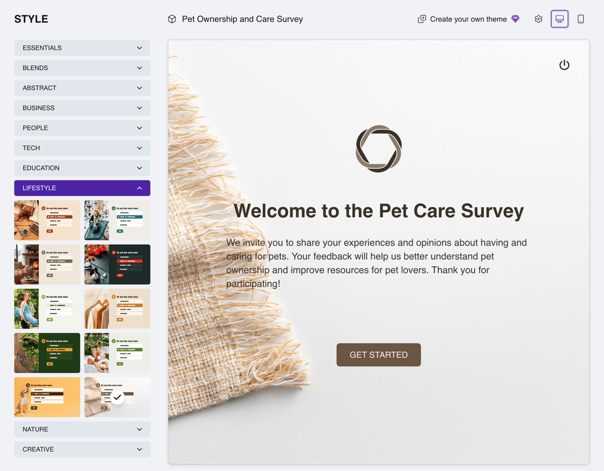
The theme catalog
Theme types
Themes differ by design type:
- Solid color — a single-tone background.
- Gradient — a smooth color transition.
- Background image — a full-screen photo with content on top.
- Side panel image — the screen is split: a decorative image on the left, content area on the right.
Each theme defines its own color scheme, which is applied to all survey elements.
Premium themes
Some themes are marked with a diamond icon — these are premium themes. To see what's available on your plan, check the Plans page.
You can select and pin a premium theme to your project at any time — it applies immediately in your own preview. On the Free plan, however, premium themes are not shown to respondents: they see the default theme. As soon as you upgrade your plan, the pinned theme becomes visible to respondents right away — no need to select it again.

Brand themes
On the Business plan, you can create your own brand themes — with your colors, fonts, logo, and backgrounds. Your surveys then look like a native part of your product or website and keep a consistent brand style. Take any theme as a starting point and click Create your own theme to tailor it to your brand. Creating custom themes is covered in a separate article.