Builder overview
The builder is the main working screen for creating and configuring a survey. It opens when you click any project in the Projects list.
Five stages of work
At the top of the builder there are five tabs — the stages of survey development and launch:
- Builder — adding questions, configuring logic and content.
- Style — choosing a visual theme and test-running the survey.
- Publish — setting up audiences, getting a link, embedding on a website.
- Integrations — connecting external services for automatic data transfer.
- Results — viewing statistics and individual responses.
To the right of the tabs you will find: the survey Settings button, a button to collapse/expand all questions, and the survey status indicator.

The builder's top navigation
Builder tab structure
The working area of the Builder tab consists of three zones from top to bottom:
- Welcome Page — the greeting screen the respondent sees before starting the survey. Contains a title, text, and logo. Can be disabled in settings.
- Question area — the main working zone. Here you add, drag and configure questions. You can insert a question anywhere: hovering between blocks reveals an add button «+» that opens a panel with all question types, grouped by color.
- Final Page — the page the respondent sees after completing the survey. Contains a thank-you message and optional social media links.
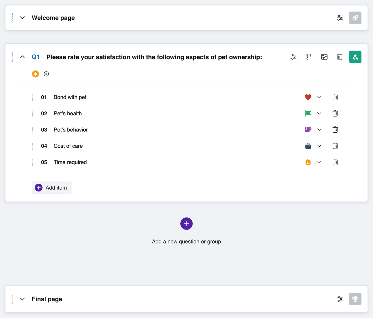
The Builder tab
Left panel
On the left side of the builder there are two libraries you can switch between:
- Question Templates — ready-made question wordings grouped by thematic categories (feedback, preferences, demographics, brand, and more). A question is added to the survey with one click or via preview.
- Favorites — your personal question library for reuse. Questions are added to favorites from the settings of any question in the builder. Favorites can be organized into sections, and access can be shared with your team.
Survey settings
The Settings button in the top panel opens a window with two tabs:
Survey Settings — general display parameters:
- Survey logo.
- Display of the welcome page, progress bar, and question numbering.
- A Back button for returning to the previous question.
- Automatic transition to the next question (for single-choice types: Yes/No, Single choice, Rating, NPS®, Emotions).
- Survey timer (in minutes) — a time limit for completing the survey. When it expires, the respondent is automatically redirected to the final page. The timer's visibility to the respondent can be enabled or disabled.
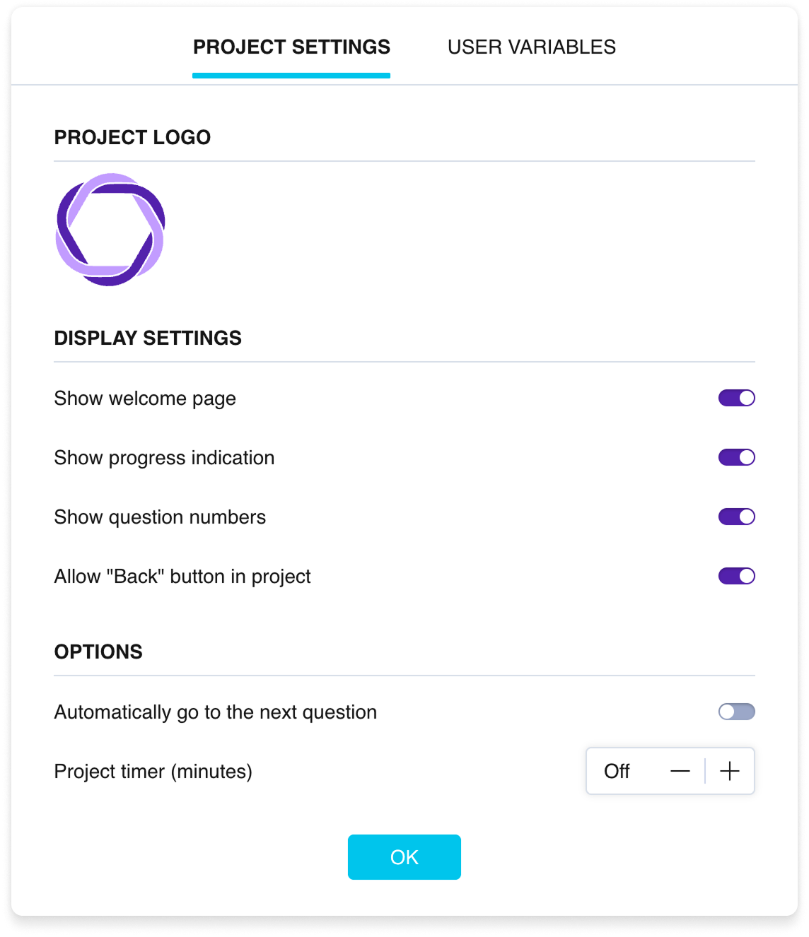
The survey settings window
User Variables — creation and management of variables that can be used in survey logic and inserted into question texts. More details in the Variables article.
Data integrity protection
Pollsar protects collected data from accidental changes:
- When the survey is open, drag & drop reordering of questions is blocked. If you try to add or delete a question, the system will warn that this may affect the accuracy of collected data.
- When responses have been collected (even if the survey is closed), warnings for adding and deleting elements still apply.
- When deleting a question linked to logic, the system will warn that deletion will break the logical connections.
In all cases you can confirm the action or cancel it.